Revitalizing 101FM Brand
A Visual Makeover for a Modern Audience
Graphic Design
Marketing

🔥 Problem Statement
Facing constant visual identity changes, 101FM aimed for a lasting and modern brand. The rebranding initiative sought to inject youthfulness into its identity.
🔍 Research and Discovery
- Listener Surveys: Gathered music preferences, artist affinities, and demographics, shaping the rebranding strategy.
- Staff Interviews: Captured internal perspectives, contributing to a holistic understanding of the organization’s goals.
- Stakeholder Meetings: Ensured alignment with the station’s long-term vision, guiding subsequent rebranding stages.
🎨 Design Process
- Conceptual Exploration: Blended the station’s history with modern appeal, shaping a concept through collaborative sessions.
- Iterative Design: Committed to iteration, testing multiple concepts for a universally resonant visual identity.
- Visual Symbolism: Incorporated a symbol reflecting music, emotion, and diversity, unifying the community.
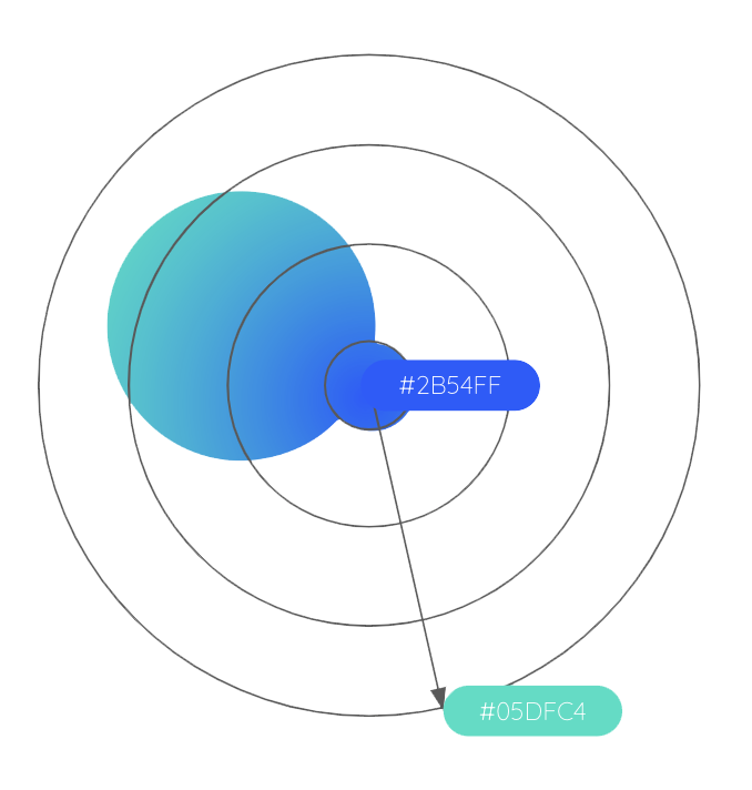
- Color Palette and Typography: Deliberate choices, with blue symbolizing tranquility and modernity, and magenta/red representing energy. Quicksand and Open Sans fonts were selected for clarity and legibility.
🚀 Implementation
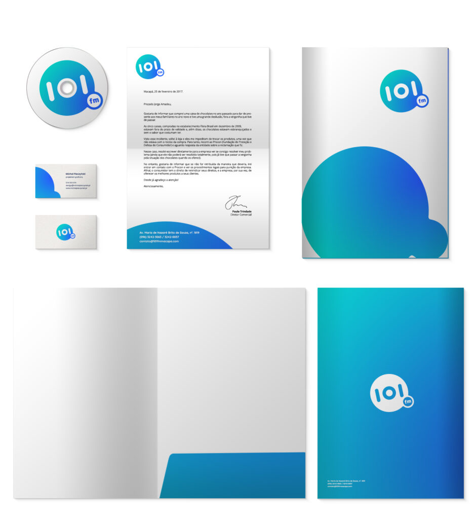
- Stationeries and Marketing Materials: Refreshed to reflect the modern and timeless design, exuding the brand’s energy.
- Digital Transformation: Revamped the website for a contemporary digital space, enhancing user experience.
- Billboards: Eye-catching displays showcased the new visual identity, leaving a striking impact in the physical landscape.


👏 Audience and Stakeholder Response
- Overwhelmingly positive response from the audience and staff, with the design sparking imitation.
- Validation of design success served as a testament to its effectiveness, making 101FM a contemporary and resonant brand in the region.